
I created this Figma plugin to streamline repetitive tasks and reduce unnecessary manual work, in alignment with Commonwealth Bank’s design system. It started as a personal tool and was later shared with a few members of the design team.
Its key features include switching between themes and component types, managing and applying styles from the design system library, and controlling spacer components to support design spec tasks.
Focus Areas
Plugin Development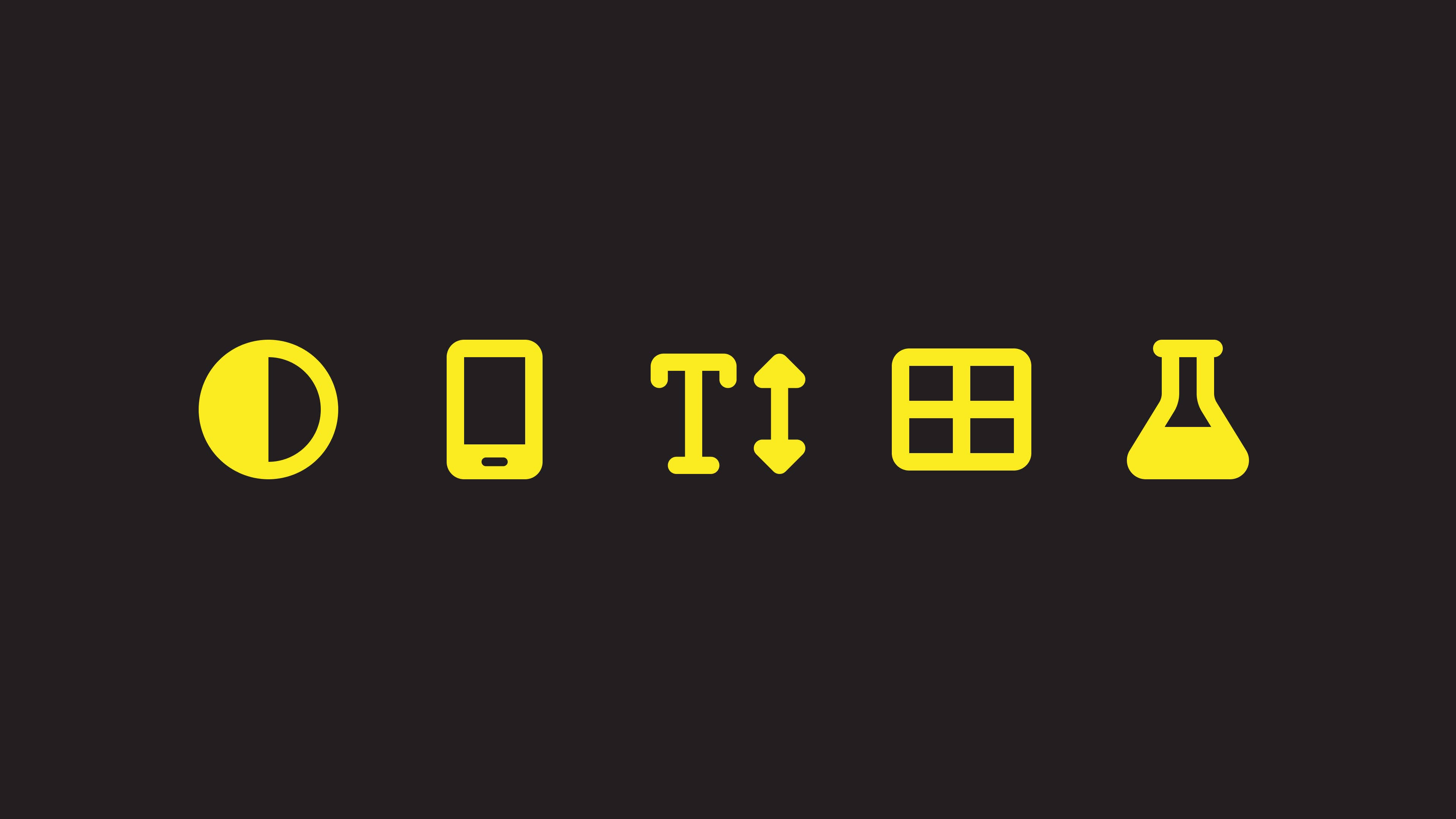
The plugin can easily change between the light and dark mode of a single frame or multiple frames at once.
This reduces a substantial amount of workload where designers needed to go through each element individually and set the theme mode one by one.


Similarly, the plugin can also easily switch between the iOS and Android specific components all at once, which again removes the manual process.


UI designers were required to make variations of a design in different text sizes for better accessibility.
Instead of manually making each variation one by one, the plugin can generate each specific dynamic text variation accordingly with a click, or all of the variations at once.


The plugin also provides a set of utility functions that automate steps required when working with auto layout, page layout, element size, etc.


The plugin works with the design system library in order to enforce the correct and consistent use of text styles.
It can set specific text styles both for iOS and Android. It can check if a design is using text styles from the library or not, and convert text layers with no styles to the corresponding text styles.


Similar to the text styles above, the plugin also works with the design system library to make sure designs use the correct colors from the library.
It can set specific color style to a fill or stroke, check if any color value is not set as color style, convert color values to color styles in the design library, and update any outdated color styles in a design to newer ones.


As a part of the developer handover process, designers were required to make a design spec version where the spacing was annotated using spacer components.
The plugin provides a comprehensive set of functions that control spacer components. It can control the visibility of the spacer components, change their types and sizes, and create spacer components based on the auto layout spacing.


